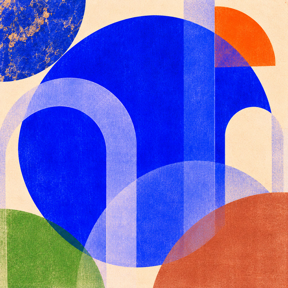
Luminous Blue Is the Colour of 2027: How to Use It Without Overwhelming Your Audience
Master Coloro's Luminous Blue, the Colour of 2027. Practical guidance for branding, UI, photography and spatial design without overwhelming audiences.
Explore 4 WePlayAmongYou studio essays, visual research plates, and cultural dispatches in the #UIDesign archive.
Master Coloro's Luminous Blue, the Colour of 2027. Practical guidance for branding, UI, photography and spatial design without overwhelming audiences.
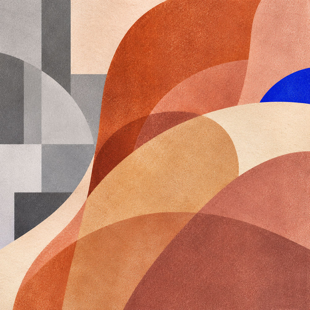
Discover why warm earth tones like clay, sandstone and rose-brown are replacing clinical whites and cool greys in 2027 design. Practical applications inside.

Master Energy Orange and Pop Pink for 2027. Learn strategic joy colour deployment for branding, UI, photography, and packaging that sparks delight.
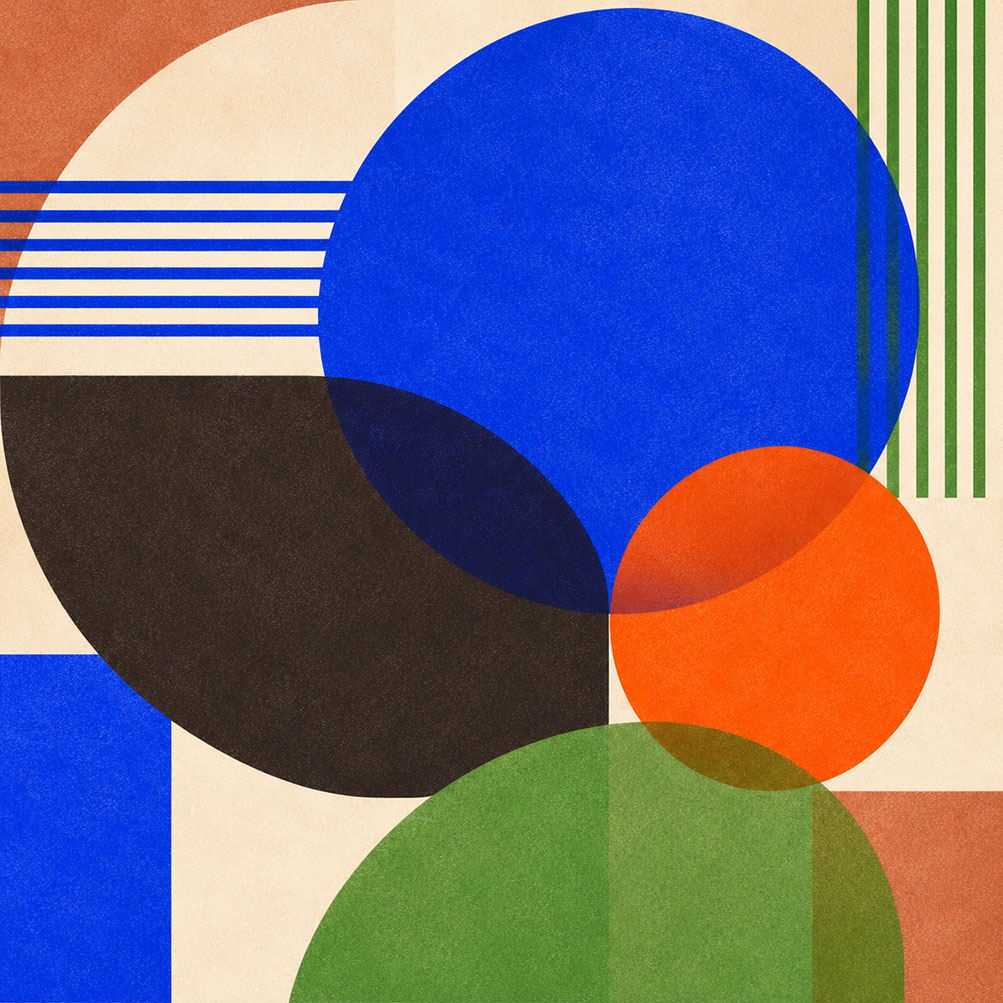
Learn to build accessible 2027 colour palettes with WCAG contrast ratios, the 60-30-10 rule, and cross-medium testing protocols for every creative discipline.
Automatically updated studio categories and top #tags across seasonal styling, colour design, live AV, street art & illustration