EPISODE 6-Contemporary Surrealism in Illustration 2027: 7 Ways Dreamlike Imagery Is Transforming Commercial Creativity
Discover how contemporary surrealism transforms commercial illustration in 2027. Learn dreamlike imagery techniques that capture attention and connect.
 🔍 COVER PLATE — CLICK TO EXPAND
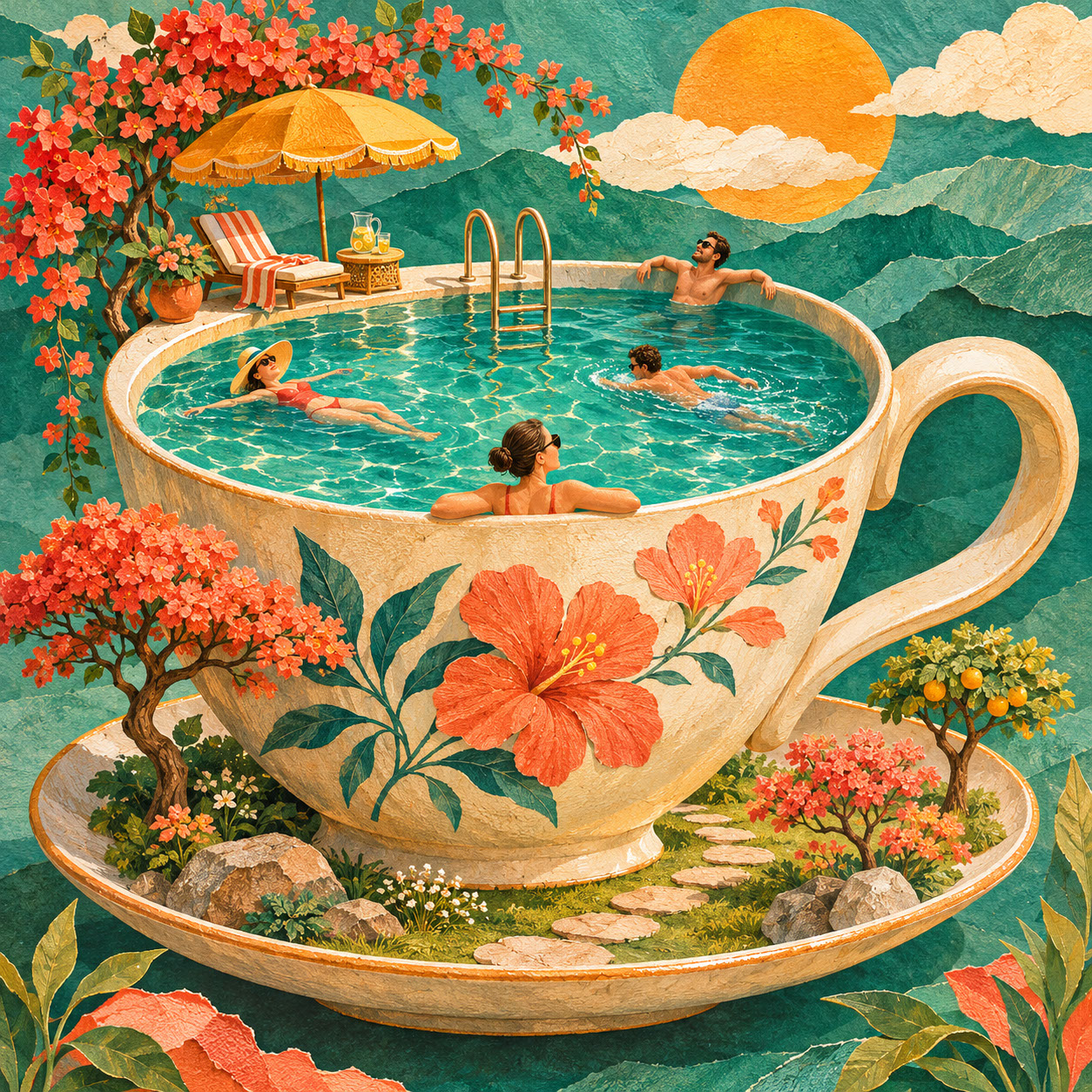
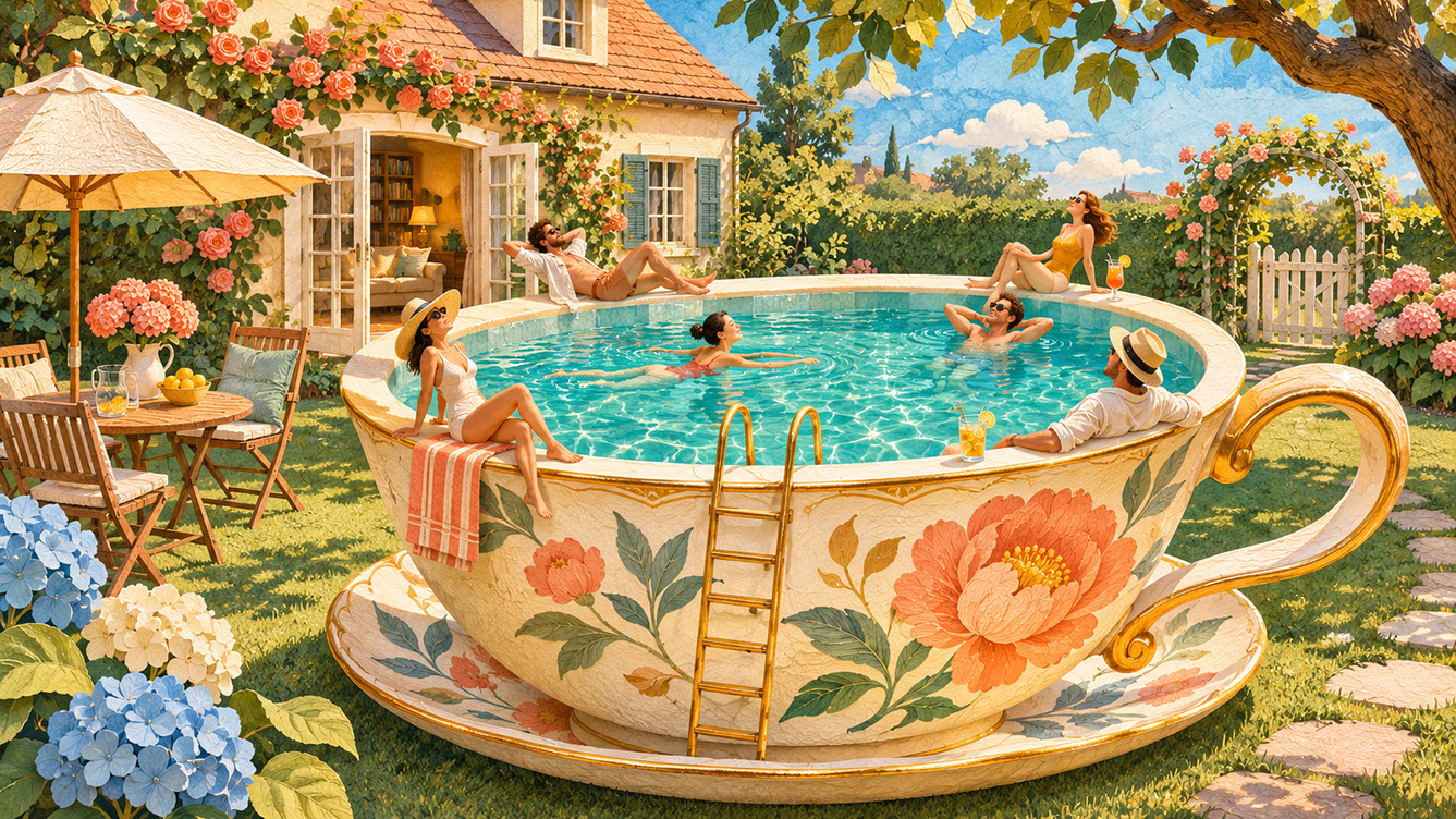
Square hero cover for Episode 6 ('Contemporary Surrealism in Illustration 2027: 7 Ways Dreamlike Imagery Is Transforming Commercial Creativity'): a giant cream ceramic teacup becomes a sunlit teal swimming pool complete with tiny swimmers, a pool ladder, coral flowers, and an ochre parasol.
Picture this: a giant teacup serving as a swimming pool in a suburban garden, complete with tiny sunbathers lounging on the rim. Or perhaps houses sprouting leaves from their chimneys whilst clouds drift through open windows. Something wonderfully unexpected is happening in illustration, and it's capturing attention like never before.
Welcome to the world of contemporary surrealism in 2027, where dreamlike imagery isn't just for gallery walls anymore—it's become a powerful force in commercial creativity. In a visual landscape where audiences are overwhelmed by predictable imagery, the unexpected has become irresistible. And here's the fascinating thing: as AI tools have expanded our appetite for visual experimentation, the demand for purposeful, emotionally resonant surreal illustration has grown stronger than ever.
In this episode, we'll explore how to incorporate surreal elements effectively, maintain conceptual clarity whilst pushing creative boundaries, use AI as a collaborative tool, and create imaginative work that genuinely connects with audiences rather than alienating them. Whether you're illustrating for packaging, editorial, greeting cards, or brand campaigns, these techniques will help you stand out in the most memorable ways.
 🔍 PLATE 01 — CLICK TO EXPAND
7 Ways Dreamlike Imagery Transforms Creativity — Lead narrative plate for Episode 6: a giant ceramic teacup serves as a sparkling swimming pool in a sunlit suburban garden with tiny sunbathers lounging on its rim and a miniature ladder descending into the teal water. Colour Palette: Deep Teal (#134E4A), Warm Coral (#F26A4B), Golden Ochre (#D99B26), Soft Studio Cream (#F6EFE2)
Making Surrealism Accessible: The Power of Familiar Objects in Unexpected Combinations
Here's something that might surprise you: the most effective contemporary surrealism doesn't abandon reality entirely—it transforms it. The key to commercial surrealism lies in starting with recognisable elements that audiences understand before introducing the unexpected.
Think about it this way: when viewers encounter familiar objects like domestic items, natural elements, common animals, or recognisable spaces, they feel grounded. They have a point of reference, an anchor. Then, when you introduce the surreal transformation, it creates delight rather than confusion.
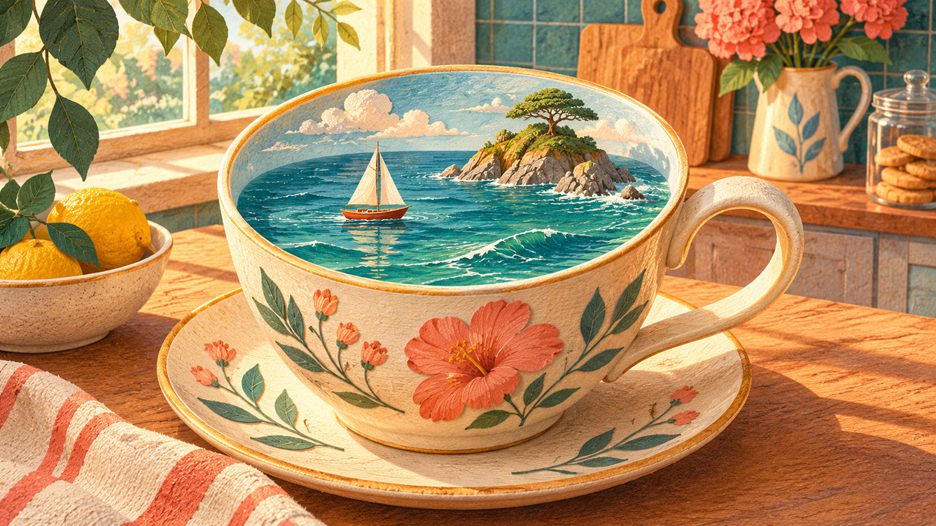
The magic happens in unexpected combinations. Merging categories works beautifully—organic with mechanical, natural with architectural, domestic with wild. Consider houses growing from flower stems, keys unlocking clouds, or teacups containing entire oceans. These combinations feel delightful rather than disturbing because they maintain that crucial connection to the familiar.
Children's illustration has long understood this balance, and commercial surrealism follows the same principle. When audiences can enter an image without confusion, the surreal elements become captivating rather than off-putting. My practical suggestion? Start with one familiar anchor and introduce one surreal transformation rather than multiple competing impossibilities.
 🔍 PLATE 02 — CLICK TO EXPAND
The Power of Familiar Objects in Unexpected Combinations — Accessible surrealism study for 'Making Surrealism Accessible: The Power of Familiar Objects in Unexpected Combinations': a recognizable cream teacup on a morning kitchen table holds a miniature teal ocean with a tiny sailboat and rocky island. Colour Palette: Deep Teal (#134E4A), Warm Coral (#F26A4B), Golden Ochre (#D99B26), Soft Studio Cream (#F6EFE2)
Transforming Everyday Scenes Through Altered Scale and Unusual Juxtapositions
Scale manipulation is perhaps the most immediately effective surreal technique available to illustrators. Making the familiar suddenly unfamiliar through size relationships creates instant visual impact that stops viewers in their tracks.
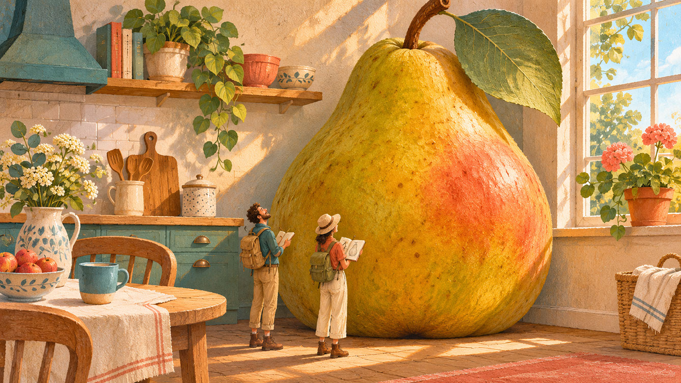
Consider the drama of scale: oversized fruits in domestic kitchens, tiny figures navigating enormous objects, buildings small enough to hold in your palm. Each of these scenarios creates distinct emotional effects. Giant elements evoke awe and wonder, whilst miniaturised figures suggest vulnerability or playfulness. The power dynamics shift entirely based on scale relationships.
Juxtaposition strategies extend beyond size. Placing elements from different contexts together—sea creatures in urban scenes, celestial objects in domestic spaces—creates visual conversations between unlikely companions. The key is maintaining compositional balance when combining these disparate elements.
From a commercial perspective, scale-based surrealism works brilliantly across product categories. Packaging gains shelf presence, editorial illustrations demand attention, and greeting cards create those wonderful moments of surprise and delight. Scale-based surreal imagery also photographs and shares exceptionally well on social media, making it a powerful tool for organic reach.
 🔍 PLATE 03 — CLICK TO EXPAND
Transforming Everyday Scenes Through Altered Scale and Unusual Juxtapositions — Scale transformation plate for 'Transforming Everyday Scenes Through Altered Scale and Unusual Juxtapositions': an enormous tactile golden pear fills a sunlit kitchen while two miniature explorers with sketchbooks marvel from its base. Colour Palette: Deep Teal (#134E4A), Warm Coral (#F26A4B), Golden Ochre (#D99B26), Soft Studio Cream (#F6EFE2)
Floating Forms, Impossible Landscapes and Dreamlike Atmospheres
Beyond individual objects, surreal illustration creates entire environments that operate by different rules—spaces where gravity, physics, and logic work in unexpected ways.
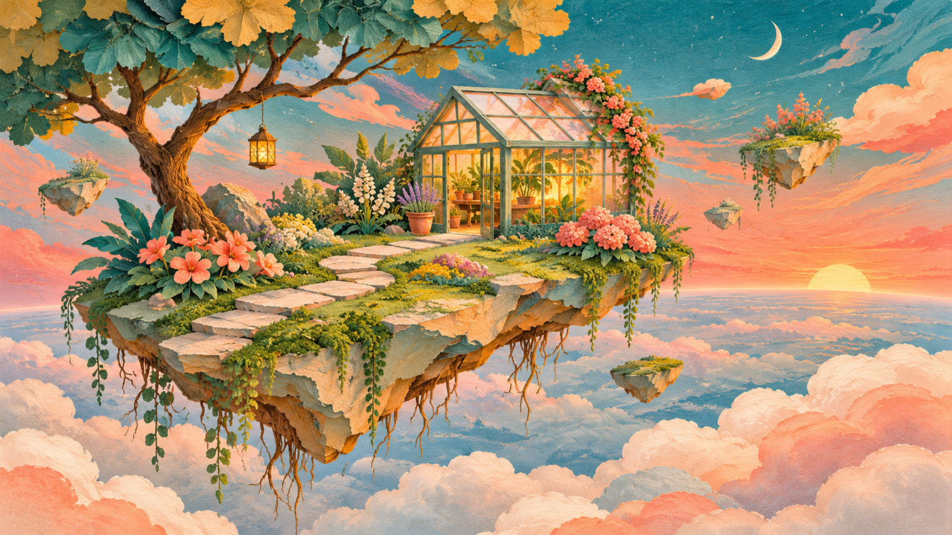
Creating dreamlike space involves several techniques: floating elements that defy gravity, shadows cast from impossible angles, horizons that curve in unexpected directions. The atmospheric qualities matter enormously too—soft edges, unusual light sources, and colour that defies natural logic all contribute to that unmistakable dreamlike quality.
Impossible landscapes blend multiple locations seamlessly: underwater forests, aerial gardens, spaces that exist both inside and outside simultaneously. Architecture can defy expectations whilst remaining structurally believable within the world you're creating. The trick is establishing internal consistency within your impossibility.
Atmosphere plays a crucial role in making these spaces inviting rather than threatening. Colour temperature, lighting direction, and textural softness all influence whether your dreamlike world feels welcoming or unsettling. Study how actual dreams feel—they're often mundane settings with subtle wrongness rather than obviously fantastical imagery. This observation can transform your approach to surreal illustration.
 🔍 PLATE 04 — CLICK TO EXPAND
Floating Forms, Impossible Landscapes and Dreamlike Atmospheres — Atmospheric worldbuilding plate for 'Floating Forms, Impossible Landscapes and Dreamlike Atmospheres': a tranquil floating garden island with a small glasshouse and suspended stones drifts above soft coral-and-teal twilight clouds. Colour Palette: Deep Teal (#134E4A), Warm Coral (#F26A4B), Golden Ochre (#D99B26), Soft Studio Cream (#F6EFE2)
Conceptual Anchors: Ensuring Surreal Elements Communicate Meaning
Here's the truth about commercially successful surreal illustration: it isn't random strangeness. It's purposeful impossibility that communicates specific ideas or emotions. Audiences respond to surrealism that says something versus surrealism that merely looks unusual.
Building symbolic visual language requires understanding universal symbols and transforming them through surreal treatment. Houses growing leaves suggest home and nature connection. Giant keys represent access or opportunity. Floating figures evoke freedom or disconnection. These visual metaphors work because audiences decode them intuitively.
For commercial work, clarity is paramount. Briefs benefit enormously from surreal interpretation when the underlying concept is clear. Before finalising any surreal illustration, test whether the intended message survives the surreal transformation. Ask yourself: does the audience understand what I'm communicating?
My recommendation is to always start creative work with the message or emotion you want to convey, then find surreal visual expressions that serve that purpose. This approach ensures your surrealism enhances rather than obscures communication.
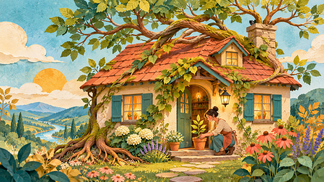 🔍 PLATE 05 — CLICK TO EXPAND
Ensuring Surreal Elements Communicate Clear Visual Meaning — Visual metaphor study for 'Conceptual Anchors: Ensuring Surreal Elements Communicate Meaning': a welcoming cottage sprouts living branches and foliage from its roof while roots anchor gently into the garden soil, communicating belonging and sustainable growth. Colour Palette: Deep Teal (#134E4A), Warm Coral (#F26A4B), Golden Ochre (#D99B26), Soft Studio Cream (#F6EFE2)
AI Tools and the Appetite for Visual Experimentation
AI image generation has significantly influenced both the production and consumption of surreal imagery. Widespread AI-generated visuals have normalised impossible imagery in ways that create both opportunities and challenges for illustrators.
The effect is double-edged: audiences are more open to surrealism than ever before, but they're also more exposed to it. This is precisely why human-directed surrealism offers something AI cannot easily replicate—intentionality, emotional depth, and meaningful creative choices.
Using AI as a creative collaborator can be incredibly valuable for early ideation. AI tools excel at generating unexpected combinations, discovering surprising juxtapositions, and exploring scale variations you might not consider independently. They're brilliant for breaking creative habits and suggesting new directions.
However, AI-generated imagery rarely succeeds as finished illustration. Human judgement remains essential for refining concepts, directing outcomes, and completing surreal work with genuine artistic intention. The most effective approach treats AI as an ideation partner whilst maintaining complete ownership of final creative direction.
Try using AI for prompt experiments and combination discovery, then take those sparks of inspiration and develop them through your own artistic process. This workflow captures AI's generative capabilities whilst ensuring distinctly personal outcomes.
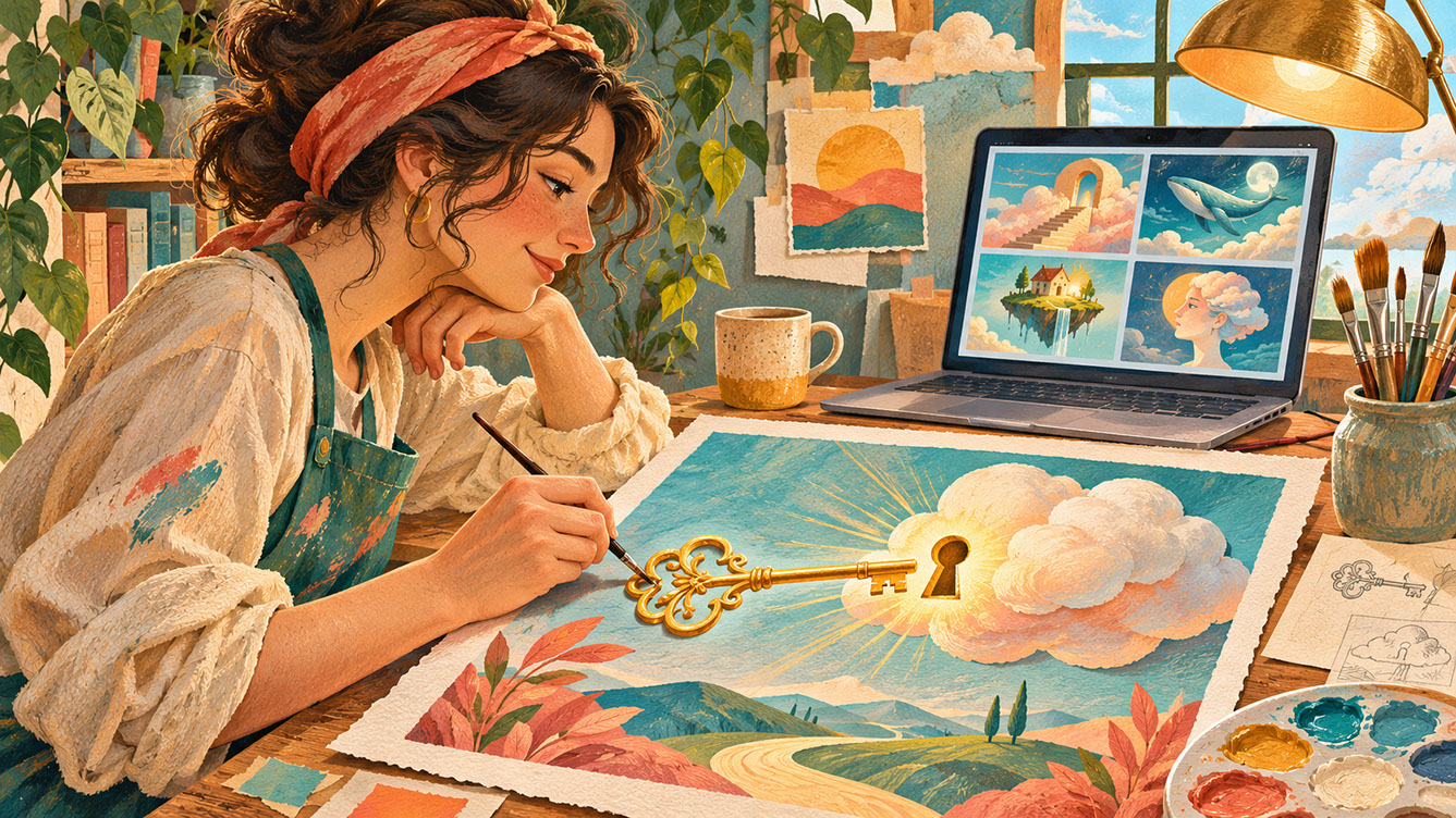 🔍 PLATE 06 — CLICK TO EXPAND
AI Tools and the Appetite for Visual Experimentation — Human Creative Direction First — Ideation workflow plate for 'AI Tools and the Appetite for Visual Experimentation': an artist reviews early concept thumbnails on a screen before hand-painting a refined gouache illustration of a brass key unlocking a drifting cloud on textured paper. Colour Palette: Deep Teal (#134E4A), Warm Coral (#F26A4B), Golden Ochre (#D99B26), Soft Studio Cream (#F6EFE2)
Standing Out Commercially: How Surrealism Serves Business Purposes
In crowded markets, surreal illustration offers genuine commercial advantage. In saturated visual environments, predictable imagery simply gets overlooked. Surreal elements create pause, demand engagement, and stay memorable long after viewers have scrolled past.
The shareability factor cannot be overstated. Unexpected imagery generates conversation and organic reach in ways that conventional illustration simply doesn't. People share what surprises and delights them, and surreal imagery delivers both.
Commercial applications span numerous categories. Packaging that stands out on shelves through impossible imagery. Editorial illustration that makes readers stop and consider. Advertising campaigns that achieve memorability through surreal concepts. Greeting cards and stationery that surprise and delight recipients.
For brand differentiation, surreal visual identity distinguishes companies from competitors in powerful ways. Creating distinctive visual languages that audiences recognise requires courage—commissioning surreal work feels risky to many clients. But the rewards justify that courage when the execution is thoughtful and purposeful.
When pitching surreal approaches, demonstrate confidently how unexpected imagery serves commercial goals rather than undermining them. Frame surrealism as a strategic advantage, not an artistic indulgence.
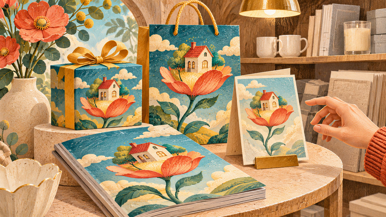 🔍 PLATE 07 — CLICK TO EXPAND
How Surrealism Serves Brand, Packaging & Editorial Purposes — Commercial standout plate for 'Standing Out Commercially: How Surrealism Serves Business Purposes': packaging, an editorial magazine, and a greeting card featuring a tiny house blooming from a flower stem command attention on a retail display. Colour Palette: Deep Teal (#134E4A), Warm Coral (#F26A4B), Golden Ochre (#D99B26), Soft Studio Cream (#F6EFE2)
Balancing Whimsy with Emotional Resonance: Connecting Rather Than Alienating
The most successful commercial surrealism creates emotional connection, not distance. It invites audiences into imaginative worlds rather than making them feel excluded or confused.
The warmth factor matters enormously. Surreal imagery needs emotional accessibility alongside visual surprise. Colour choices, character expressions, and compositional elements that create welcome all contribute to warmth. Avoiding coldness, menace, or confusion prevents pushing audiences away.
Consider your audience carefully. Understanding who will encounter the work—and what they need from it—influences appropriate levels of surreal intensity. Children's publishing, greeting cards, and lifestyle brands often benefit from gentler surrealism, whilst editorial or advertising contexts might support bolder approaches.
The emotional core must remain intact. Surreal imagery should express recognisable human feelings: joy, wonder, longing, comfort, curiosity. These emotions connect across the surreal divide, allowing audiences to feel something meaningful even when viewing impossible scenes.
Test surreal concepts with this question: does this make me feel something, or just notice something unusual? If the answer is only the latter, the work needs more emotional grounding.
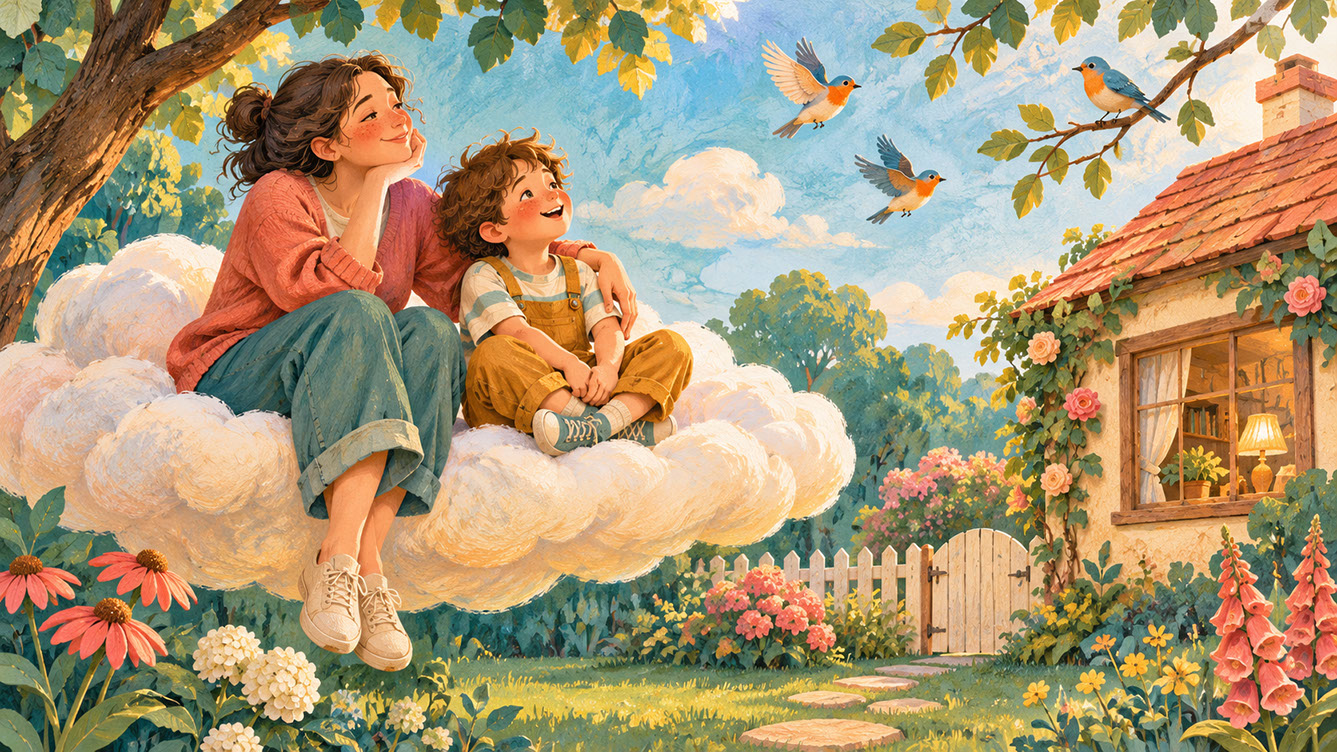 🔍 PLATE 08 — CLICK TO EXPAND
Connecting Rather Than Alienating — Emotional resonance plate for 'Balancing Whimsy with Emotional Resonance: Connecting Rather Than Alienating': an adult and child sit comfortably together on a soft cloud resting just above their back garden, watching small birds in warm sunlight. Colour Palette: Deep Teal (#134E4A), Warm Coral (#F26A4B), Golden Ochre (#D99B26), Soft Studio Cream (#F6EFE2)
Frequently Asked Questions
How do I know if my surreal imagery is too strange for commercial use?
Test whether the core message or emotion remains clear despite the surreal elements. If audiences understand what you're communicating and feel something in response, the surrealism is working commercially.
Can surreal illustration work for conservative clients or traditional industries?
Often yes, when approached thoughtfully. Subtle scale shifts or gentle impossibilities can introduce freshness without overwhelming. Start with familiar elements and introduce surreal touches gradually to build client confidence.
How do I develop my own surreal visual vocabulary?
Begin by identifying recurring symbols, objects, and environments in your imagination. Experiment with combining these in unexpected ways, and return to combinations that feel both surprising and meaningful to you.
 🔍 PLATE 09 — CLICK TO EXPAND
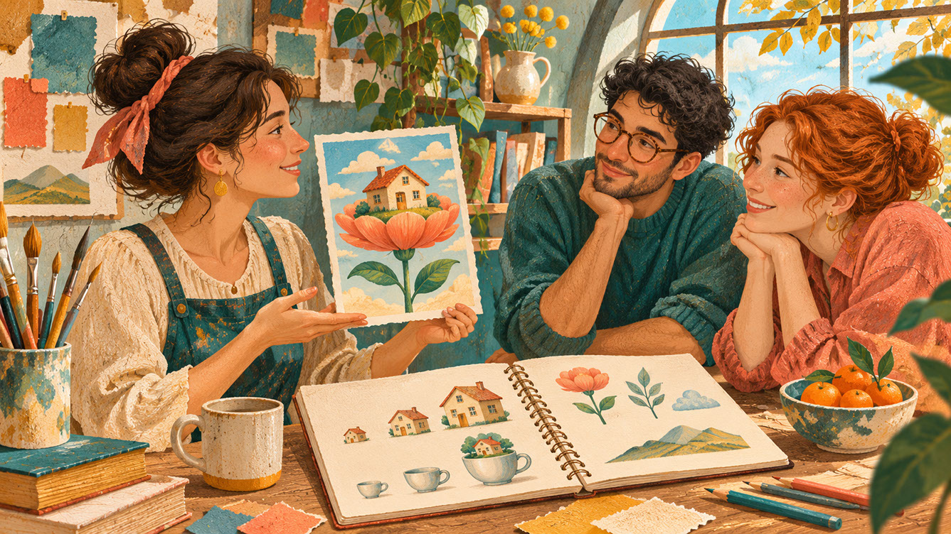
Frequently Asked Questions About Contemporary Surrealism in 2027 Illustration — Creative review plate for 'Frequently Asked Questions': an illustrator shares a conceptual study of a house blooming on a flower stem with two colleagues around a studio table, testing clarity and emotional resonance. Colour Palette: Deep Teal (#134E4A), Warm Coral (#F26A4B), Golden Ochre (#D99B26), Soft Studio Cream (#F6EFE2)
Conclusion
Contemporary surrealism offers illustrators a powerful toolkit for creating memorable, commercially effective work. The core principles remain consistent: build accessibility through familiar anchors, maintain conceptual clarity behind surreal choices, use AI as collaborator rather than replacement, leverage commercial advantage through memorable imagery, and prioritise emotional connection above all else.
The interplay between surreal elements and the tactile aesthetics, bold colour palettes, expressive characters, and collage techniques we've explored in previous episodes creates extraordinary creative possibilities. Each approach can support and enhance surreal storytelling in unique ways.
I encourage you to experiment with one surreal element in your next project—perhaps a scale shift, an unexpected combination, or a dreamlike atmosphere—and observe how audiences respond. The results might surprise and delight you as much as they do your viewers.
 🔍 PLATE 10 — CLICK TO EXPAND
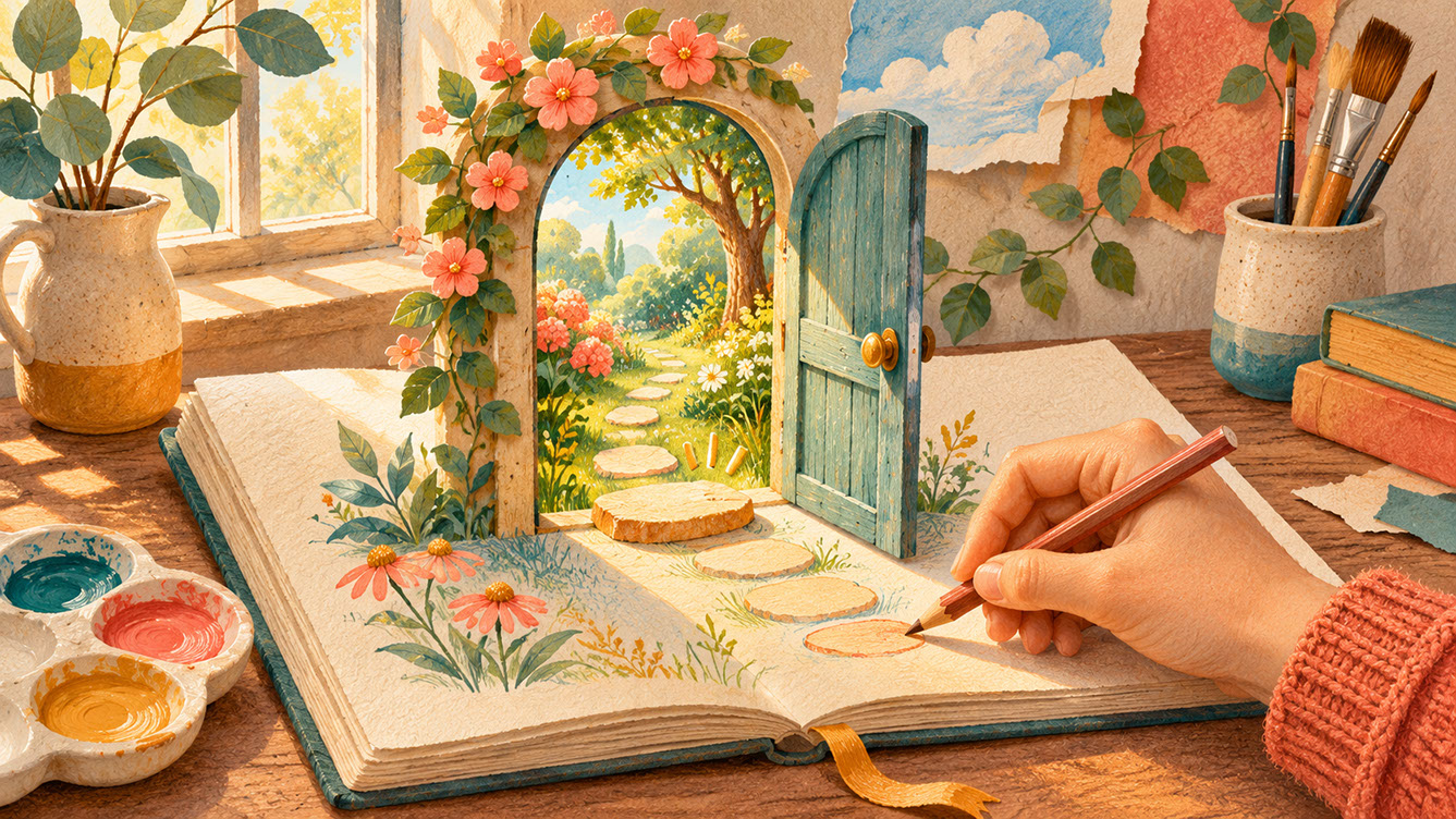
Conclusion — Starting with One Small Surreal Experiment in Your Creative Practice — Closing poetic plate for 'Conclusion': an artist's hand draws a simple garden door in an open sketchbook as the door stands gently upright from the paper and opens onto a sunlit miniature botanical world. Colour Palette: Deep Teal (#134E4A), Warm Coral (#F26A4B), Golden Ochre (#D99B26), Soft Studio Cream (#F6EFE2)
⚡ 5 Strategies to Consider
STUDIO PLAYBOOK // 5 DIRECTIVES❓ Frequently Asked Questions — 5 Q&As (5 Q&As)
SCHEMA.ORG/FAQPAGE // 5 Q&As (5 Q&As)Q1. What makes contemporary surrealism different from traditional surrealist art?
Contemporary surrealism in 2027 illustration focuses on commercial accessibility and emotional connection rather than purely artistic expression. It transforms familiar, everyday objects through unexpected combinations and scale shifts whilst maintaining clear conceptual meaning, making it suitable for packaging, editorial, greeting cards, and brand campaigns.
Q2. How can I make surreal imagery accessible to mainstream audiences?
Start with recognisable elements that audiences understand—domestic items, natural objects, common animals, or familiar spaces—before introducing surreal transformations. This creates a grounded foundation that allows viewers to enter the image without confusion, making the impossible elements delightful rather than alienating.
Q3. What role does scale manipulation play in surreal illustration?
Scale manipulation is one of the most immediately effective surreal techniques. Oversized and miniaturised elements create instant visual impact and distinct emotional effects—giant elements evoke awe, whilst tiny figures suggest vulnerability or playfulness. Scale-based surrealism works excellently across commercial applications and shares well on social media.
Q4. How do I ensure my surreal illustrations communicate clear meaning?
Start with the message or emotion you want to convey, then find surreal visual expressions that serve that purpose. Build symbolic visual language using universal symbols transformed through surreal treatment, and test whether your intended message survives the surreal transformation before finalising the work.
Q5. How can AI tools help with creating surreal illustrations?
AI tools excel as ideation partners for surreal work—use them for generating unexpected combinations, discovering surprising juxtapositions, and exploring scale variations you might not consider independently. However, maintain ownership of final creative direction, as human judgement remains essential for refining concepts with genuine artistic intention.