Beyond the Filter: Why Analogue Textures Are Becoming Brand Trust Signals in 2026
Learn why genuine analogue textures—film grain, letterpress ink, raw paper fibres, and visible process—outperform decorative digital filters in 2026.
 🔍 COVER PLATE — CLICK TO EXPAND
Have you ever scrolled past an image so polished it felt almost invisible? You are not alone. In 2026, consumers have developed an almost instinctive ability to distinguish between authentic texture and applied filters—and this distinction matters more than ever. The perfectly smooth, algorithmically optimised visual that would have impressed audiences five years ago now triggers suspicion rather than admiration.
In Episode 1 of this series, we explored the trust crisis reshaping brand communication—how generative AI has fundamentally devalued technical perfection as a trust signal, and why consumers have shifted from asking 'Does this look professional?' to 'Does this feel real?' We established that 93% of consumers want brand communications that feel genuinely human, and that authorship has become the new trust currency.
Now the natural follow-up question emerges: if polished perfection no longer communicates quality, what visual language does signal genuine human involvement? The answer lies in analogue textures—those beautifully imperfect marks that prove a human hand was present in the creative process.
 🔍 PLATE 01 — CLICK TO EXPAND
Plate 01 — Design Studio Pinboard With Physical Paper Proofs, 35mm Contact Sheets, and Graphite Sketches: Plate 01 (Introduction): A contemporary design studio wall pinned with physical letterpress proofs, torn deckle edges, and silver-halide contact sheets in warm window light.
Why Imperfection Captures Attention: The Psychology of Visible Process
Let me share something fascinating about how our brains process visual information. When we encounter perfectly uniform, pristine imagery, our cognitive systems essentially place it on autopilot. The brain recognises smoothness as requiring minimal analysis and moves on quickly. However, when we encounter texture—film grain, torn edges, ink variations—something quite different happens.
Analogue textures function as visual speed bumps. They introduce what behavioural designers call productive friction, slowing the eye and demanding deeper engagement. This is not a bug; it is a feature. The brain must work slightly harder to process varied, textured imagery, and this additional cognitive effort creates stronger memory formation and emotional resonance.
Think of it as the difference between driving on a motorway versus a winding country lane. The motorway gets you there efficiently, but the country lane creates the memorable journey. In visual communication, analogue textures create that memorable journey for your audience.
Visible process signals—evidence that a human hand was involved—function as mental shortcuts that help audiences assess trustworthiness almost instantaneously. When someone sees pencil guidelines beneath a finished illustration or scanner artefacts on a photograph, their brain registers this as proof of authentic creation. These marks communicate labour, care, and human decision-making in ways that pristine digital perfection simply cannot.
 🔍 PLATE 02 — CLICK TO EXPAND
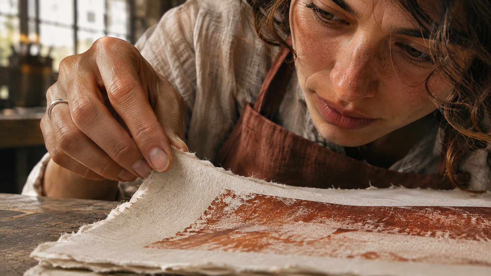
Plate 02 — Macro View of Fingertips Inspecting Uneven Letterpress Ink and Deckle Paper Fibres: Plate 02 (Psychology of Visible Process): Close inspection of debossed ink impression and irregular cotton fibres that create productive visual friction and reward viewer attention.
The Complete Visual Vocabulary of Human Presence
Understanding the psychology is one thing, but applying it requires a comprehensive vocabulary of analogue textures. Let us explore the full taxonomy available to designers and brands seeking to communicate authentic human involvement.
Film Grain and Motion Blur
Film grain introduces organic randomness that digital sensors do not naturally produce. Each grain pattern is unique, carrying the chemical fingerprint of a specific moment captured on actual film stock. Motion blur similarly serves as evidence of real-world physics and time—something AI-generated imagery frequently fails to replicate convincingly.
The key distinction here lies between authentic film grain, with its characteristic clustered structure, and digital noise or artificially applied grain filters. Trained eyes can spot the difference, and increasingly, so can your average consumer.
Paper-Based Textures
Torn paper edges create irregular, organic lines that cannot be algorithmically replicated without appearing mechanical. There is something fundamentally human about the unpredictability of tearing paper by hand—no two edges are ever identical.
Rough-cut backgrounds suggest hands-on production, whilst unbleached and textured paper stocks communicate material authenticity through natural fibres, visible flecks, and subtle colour variations. Even fold marks and creases carry meaning, serving as evidence of physical handling and real-world existence.
Print Process Artefacts
Ink bleeds and uneven coverage transform from production flaws into marks of genuine creation. Scanner artefacts—the particular qualities introduced when physical materials meet digital capture, including dust specks, slight warping, and edge shadows—have become sought-after visual elements.
Photocopier degradation, contrast shifts, and registration errors signal analogue reproduction processes. Risograph and screen-printing characteristics, with their distinctive layering, colour misregistration, and unique texture, have become particularly desirable among brands seeking authentic visual presence.
Hand-Drawn Elements
Pencil guidelines visible beneath finished work show creative process in action. Sketch qualities including line weight variation, hesitation marks, and correction evidence communicate the journey from concept to completion.
Brush strokes and ink work display the organic variation inherent in hand-applied media. Calligraphic imperfection distinguishes handwritten elements fundamentally from even the most sophisticated script fonts—there is a warmth and humanity in slightly uneven letterforms that digital typography cannot replicate.
Collage and Cut-and-Paste Compositions
Visible tape and adhesive marks prove physical assembly occurred. Layering shadows create dimensional qualities that reveal actual paper layers rather than digitally composited elements. The way physical collage pieces interact—with their slight overlaps, inconsistent spacing, and organic edge relationships—differs markedly from anything created entirely on screen.
Mixed media combinations, where different materials and processes coexist within a single composition, generate visual interest through their inherent variety and the story they tell about their creation.
Annotations and Marginalia
Handwritten notes suggest ongoing thought and refinement. Corrections and amendments reveal process and decision-making. Numbering and organisational marks carry the visual language of working documents, whilst stamps, stickers, and labels indicate real-world workflow systems.
These marks transform finished pieces into documents with history—artefacts rather than outputs.
 🔍 PLATE 03 — CLICK TO EXPAND
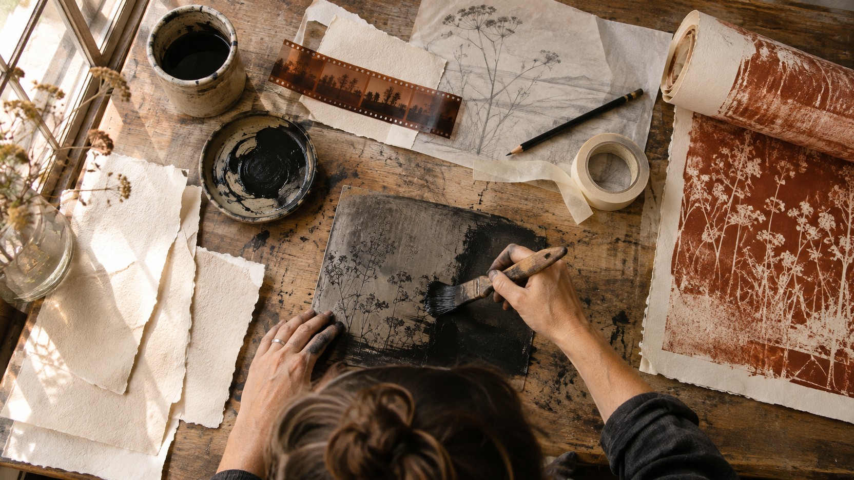
Plate 03 — Overhead Printmaking Bench With 35mm Film Strip, Sumi Ink Brush, Graphite Sketch, and Torn Paper: Plate 03 (Visual Vocabulary of Human Presence): The six core analogue signals—film grain, paper fibres, ink variation, pencil lines, torn edges, and brush marks—on a real studio bench.
The Critical Distinction: Meaningful Texture Versus Decorative Filters
Here is where things get properly interesting—and where many brands go wrong. The ready availability of texture overlays and presets has created a new form of synthetic authenticity. Adding a film grain filter to an AI-generated image does not magically imbue it with humanity; it simply adds a veneer that increasingly sophisticated audiences see straight through.
The difference between meaningful texture and decorative filters comes down to three essential questions:
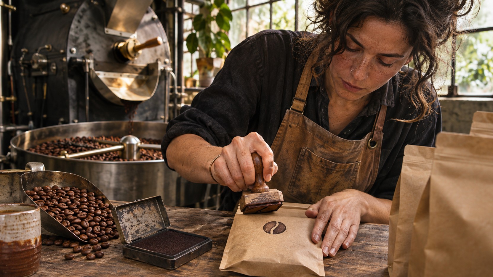
First, does this texture connect to how the brand actually creates or operates? A coffee roaster using packaging with genuine hand-stamped elements reflects their artisanal process. The same texture applied to a fintech app's marketing materials would feel disconnected and performative.
Second, could this texture be meaningfully explained if a customer asked about it? If the answer is merely 'We thought it looked nice,' the texture is decorative rather than communicative.
Third, is the texture consistent with the brand's story and values? Coherence matters enormously. Texture should be traceable to genuine process, material choice, or brand heritage.
Warning signs of superficial texture include uniform application without variation, disconnection from brand story, and following trends without clear rationale. If your texture choices feel like costume rather than character, reconsideration is warranted.
 🔍 PLATE 04 — CLICK TO EXPAND
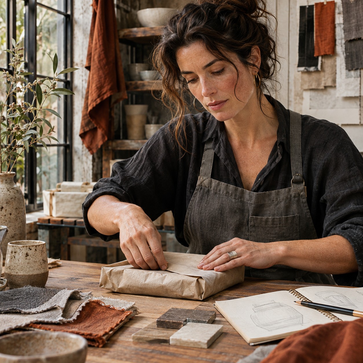
Plate 04 — Artisan Coffee Roaster Hand-Stamping Kraft Packaging Bag Beside Small-Batch Roaster: Plate 04 (Meaningful Texture vs Decorative Filters): Hand-stamped kraft packaging in a working roastery demonstrates how authentic texture emerges directly from small-batch production.
The Numbers Behind the Movement
The shift toward analogue textures is not merely anecdotal. Market evidence demonstrates clear directional movement in creative preferences and consumer demand.
Searches for hand-drawn assets on major creative platforms have increased by approximately 25%. Film grain-related searches have jumped roughly 31%. Demand for paper texture resources, vintage photography assets, and analogue design elements continues growing month on month.
What these trends reveal is significant: creative professionals are actively seeking authentic texture elements because their clients and audiences are responding to them. The search behaviour shift from queries like 'clean,' 'minimal,' and 'modern' toward 'textured,' 'organic,' and 'handmade' reflects a fundamental change in what visual communication is expected to accomplish.
 🔍 PLATE 05 — CLICK TO EXPAND
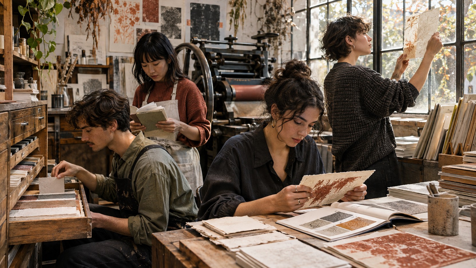
Plate 05 — Designers Selecting Textured Paper Samples and Handmade Proofs in Busy Independent Print Shop: Plate 05 (The Numbers Behind the Movement): Rising commercial demand for tactile paper stocks and analogue print proofs inside an independent studio library.
How Brands Are Making Texture Meaningful
Theory is valuable, but application is where texture strategy lives or dies. Consider how different brand categories might authentically incorporate analogue elements.
An artisan food producer using unbleached papers with visible fibre content and hand-stamped labelling creates coherence between packaging textures and production methods. The texture reinforces the craft positioning by suggesting that the same hands making the product also touched the packaging.
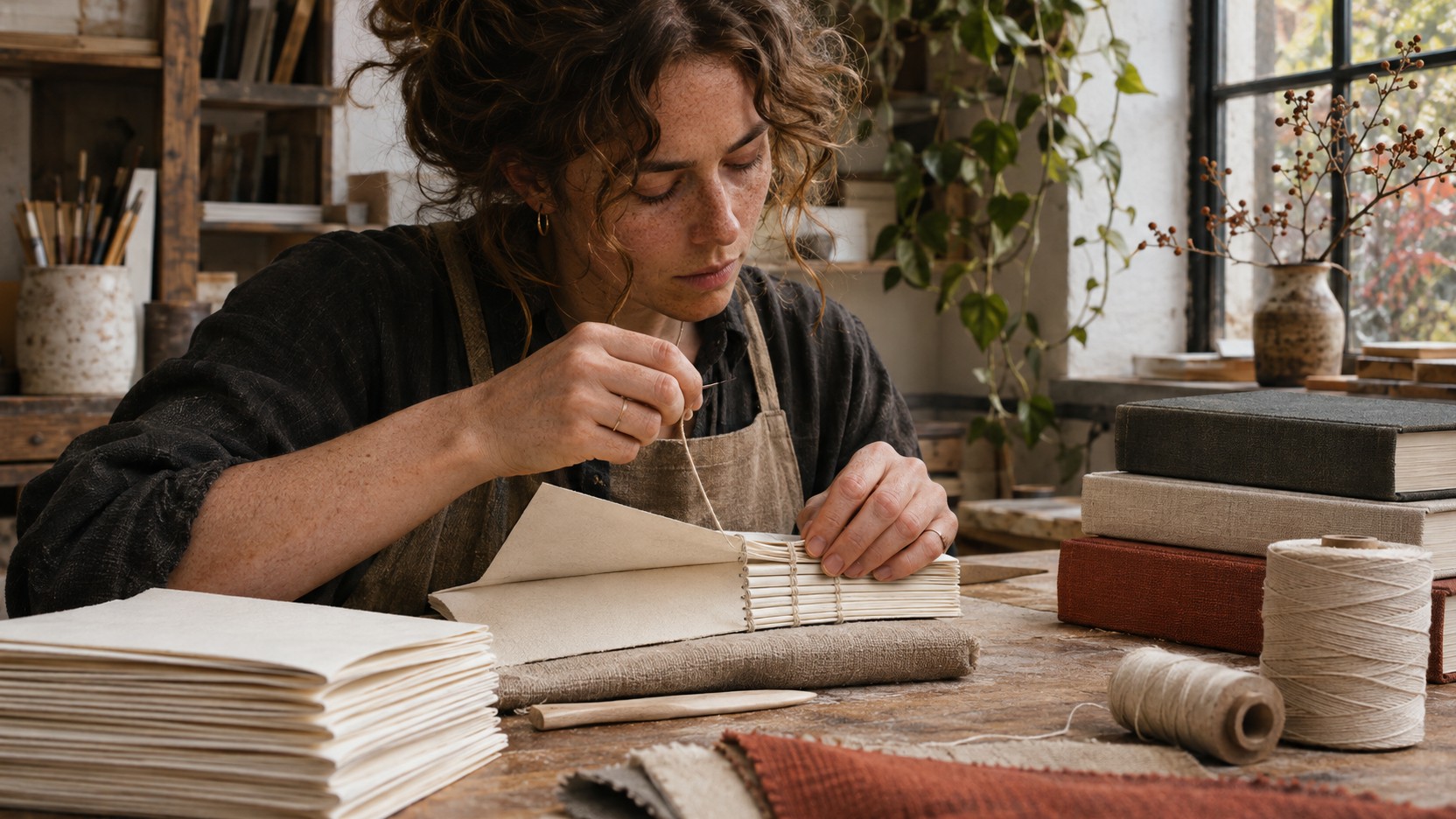
An independent publisher embracing scanner artefacts, visible binding signatures, and uncoated paper stock celebrates their medium rather than apologising for it. These texture choices differentiate them from digital-first competitors whilst communicating their commitment to physical reading experiences.
A heritage fashion label incorporating archival imagery, vintage photography aesthetics, and hand-drawn elements connects contemporary collections to brand history. Texture becomes a temporal bridge between past craftsmanship and present products, suggesting that current pieces carry forward established traditions.
In each case, texture choices are explainable and connected to genuine brand attributes. The texture tells a true story.
 🔍 PLATE 06 — CLICK TO EXPAND
Plate 06 — Independent Bookbinder Hand-Sewing Exposed Signatures With Unbleached Linen Thread: Plate 06 (Making Texture Meaningful): Exposed Smyth-sewn binding and uncoated signatures turn structural craft construction into the primary visual identity.
Frequently Asked Questions
Will analogue textures make my brand look dated or unprofessional?
When connected meaningfully to brand story and applied with intention, analogue textures communicate care and craft rather than carelessness. The key is coherence—texture should feel like a deliberate choice, not a limitation.
Can digital-first brands authentically use analogue textures?
Absolutely, when the texture connects to genuine aspects of how the brand operates, creates, or thinks. The question is whether the texture can be meaningfully explained, not whether production processes are actually analogue.
How do I know if I am using too much texture?
Texture should enhance communication, not obscure it. If texture competes with your message or feels like it is trying too hard, recalibration is needed. Less is often more when texture is meaningful.
 🔍 PLATE 07 — CLICK TO EXPAND
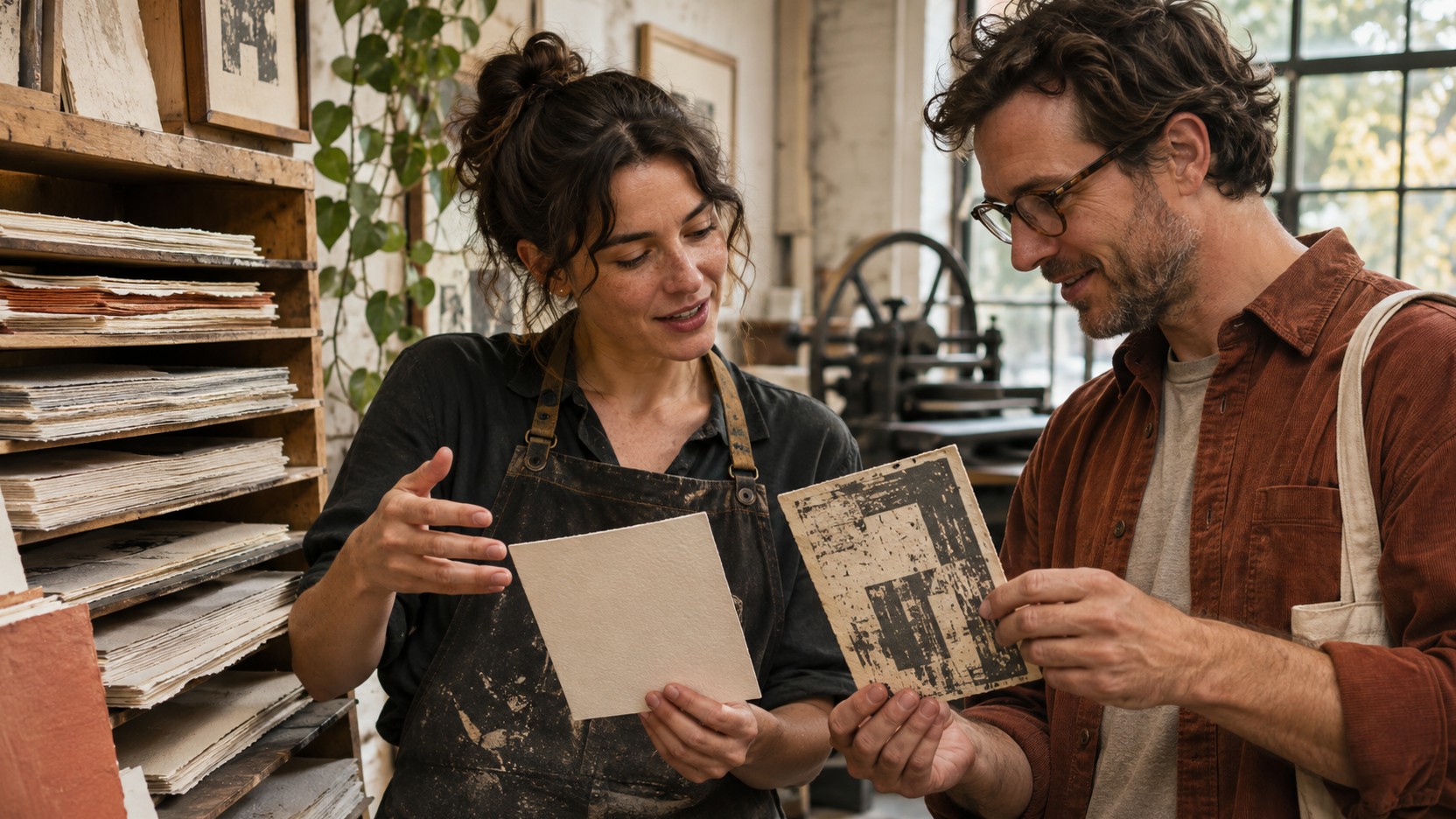
Plate 07 — Printmaker and Small Business Founder Comparing Subtle Cotton Stock With Over-Distressed Print: Plate 07 (Frequently Asked Questions): A printmaker advises a brand founder on selecting restrained, readable uncoated stock rather than heavy-handed artificial distress.
Looking Forward
Analogue textures function as visual evidence of human presence in an era when synthetic perfection has become the default. The psychology of visible process explains why these marks create engagement through productive friction—they slow the eye, demand attention, and create memory.
We have explored a comprehensive vocabulary of textures, from film grain to handwritten annotations, each carrying specific meaning and communication potential. The critical distinction between meaningful texture and decorative filters determines whether authenticity is genuinely communicated or merely performed.
Market trends confirm growing demand for these elements across creative industries, validating that this shift is structural rather than superficial.
In the end, analogue textures matter not because they are beautiful—though they often are—but because they are believable. They carry evidence of process, presence, and human decision-making that audiences have learned to seek out and trust.
In Episode 3, we expand our understanding into the realm of physical sensation. Screen Fatigue and the Tactile Revolution examines why touch matters again—and how brands are responding with tactile depth in both physical and digital experiences. We will explore how consumers spending extensive hours on flat glass surfaces experience sensory exhaustion and crave physical grounding, and discover the return of tactile materials including linen, raw timber, textured plaster, and matte finishes across consumer products and brand touchpoints.
 🔍 PLATE 08 — CLICK TO EXPAND
Plate 08 — Designer Stepping From Print Workshop Into Sunlit Material Library of Linen, Oak, and Stoneware: Plate 08 (Looking Forward): Bridging visual texture on the page with three-dimensional tactile materials—linen, oak, and stoneware—explored in Episode 3.
⚡ 5 Strategies to Consider
STUDIO PLAYBOOK // 5 DIRECTIVES❓ Frequently Asked Questions — 5 Q&As (5 Q&As)
SCHEMA.ORG/FAQPAGE // 5 Q&As (5 Q&As)Q1. What exactly are analogue textures and why are they important for brands in 2026?
Analogue textures are visual marks that result from physical, non-digital creation processes—including film grain, torn paper edges, ink bleeds, scanner artefacts, pencil guidelines, and handwritten annotations. They have become important because generative AI has made digital perfection ubiquitous and therefore valueless as a trust signal. Analogue textures serve as visual evidence of human involvement, helping brands communicate authenticity and build trust with increasingly sceptical consumers.
Q2. How do analogue textures create better audience engagement than polished digital imagery?
Analogue textures introduce what behavioural designers call productive friction—they function as visual speed bumps that slow the eye and demand deeper cognitive processing. When the brain works harder to process varied, textured imagery, it creates stronger memory formation and emotional resonance. This stands in contrast to pristine digital imagery, which the brain processes on autopilot and quickly scrolls past.
Q3. What is the difference between meaningful texture and decorative filters?
Meaningful texture connects authentically to how a brand creates or operates, can be meaningfully explained if a customer asks about it, and remains consistent with the brand's story and values. Decorative filters are superficially applied textures that have no genuine connection to brand processes or identity. The key test is whether the texture tells a true story about the brand or merely mimics an aesthetic trend.
Q4. Can digital-first brands authentically use analogue textures in their visual communication?
Yes, digital-first brands can authentically use analogue textures when those textures connect to genuine aspects of how the brand operates, thinks, or creates. The determining factor is not whether production processes are actually analogue, but whether the texture choice can be meaningfully explained and relates to real brand attributes. A tech company might authentically incorporate hand-drawn elements if sketching is part of their actual design process, for example.
Q5. What search trends indicate growing demand for analogue textures in design?
Recent data from major creative platforms shows significant growth in analogue texture searches. Hand-drawn asset queries have risen approximately 25%, whilst film grain-related searches have jumped roughly 31%. There is also notable increased demand for paper texture resources, vintage photography assets, and analogue design elements—reflecting a broader shift from search terms like 'clean' and 'minimal' toward 'textured,' 'organic,' and 'handmade.'
EXPLORE RELATED STUDIO TAGS (10):
Glad this piece sparked something — want the matching 4096×4096px .ZIP pack?
Enter your email below for an instant direct download of Studio Seamless Pattern Pack — Drop 01 (WPAY_DROP01.zip) plus new Studio Journal essays & free drops.