Screen Fatigue Is Real: Why Brands Are Betting on Touch, Texture and Tactile Design in 2026
Why screen fatigue is driving brands toward tactile packaging, heavy uncoated print, natural materials, and calm matte digital interfaces in 2026.
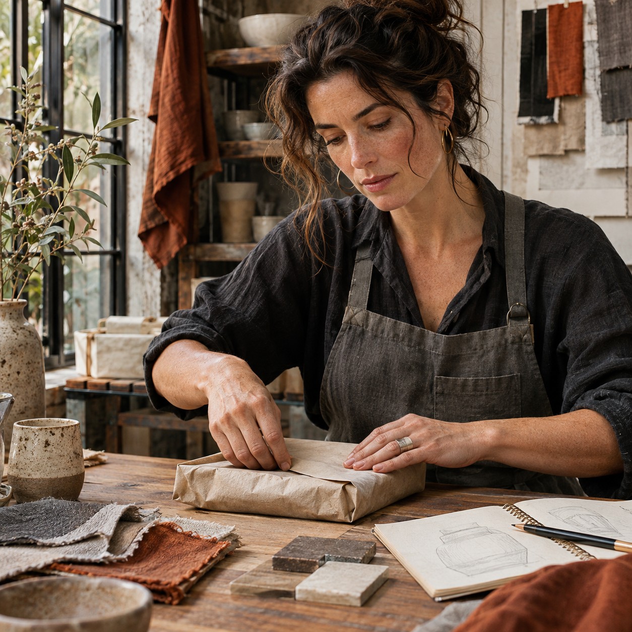
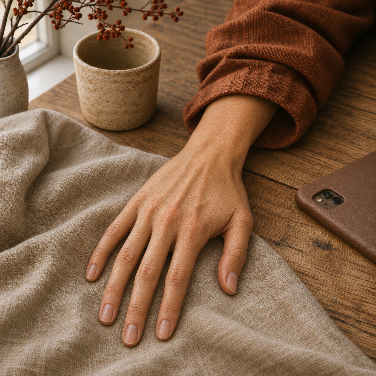 🔍 COVER PLATE — CLICK TO EXPAND
When did you last touch something that genuinely surprised your fingertips? Think about it for a moment. From the morning alarm to the evening scroll, we interact with the same smooth, unvarying glass surface hour after hour. Our phones, tablets, laptops, and smart displays all present identical tactile experiences—cool, flat, frictionless. It is a sensory monotony we have collectively accepted without much question, yet our bodies and minds are beginning to push back.
Welcome to the tactile revolution. In 2026, brands are waking up to something researchers and designers have understood for some time: we are experiencing genuine sensory exhaustion, and the antidote lies not in more pixels but in physical grounding. This is not anti-digital sentiment or nostalgic retreat—it is a necessary rebalancing act that the smartest brands are already embracing.
 🔍 PLATE 01 — CLICK TO EXPAND
Plate 01 — Person Placing Smartphone Face Down on Wooden Café Table to Hold Warm Stoneware Mug: Plate 01 (Introduction): Stepping away from frictionless glass screens to experience the temperature, weight, and surface grain of a hand-thrown stoneware mug.
The Glass Ceiling: Understanding Sensory Exhaustion
Our skin is our largest sensory organ, and touch serves as our most primal connection to the physical world. Yet consider how little tactile variation most of us experience during our waking hours. The phenomenon researchers call 'tactile hunger' describes our body's genuine need for diverse physical input—and we are collectively starving.
When we interact exclusively with smooth glass surfaces, our proprioceptive systems receive virtually no meaningful feedback. There is no grain, no give, no temperature variation, no texture to process. Emerging research increasingly connects this touch deprivation to broader wellbeing concerns, suggesting that tactile monotony contributes to feelings of disconnection and what some describe as 'digital numbness'—that nagging sense that online experiences feel increasingly insubstantial.
The psychological toll compounds the physical dimension. Purely visual interfaces demand constant cognitive processing without the sensory anchoring that touch provides. We scroll endlessly, yet nothing quite registers. We tap and swipe, yet our fingers remember nothing distinctive about the experience.
Consumers are responding instinctively, even when they cannot articulate precisely why. Digital detox retreats are flourishing. Screen-free activities are gaining cultural cachet. People increasingly describe craving 'something real' without necessarily understanding the tactile dimension of that longing. The market is speaking, and brands that listen are gaining meaningful advantage.
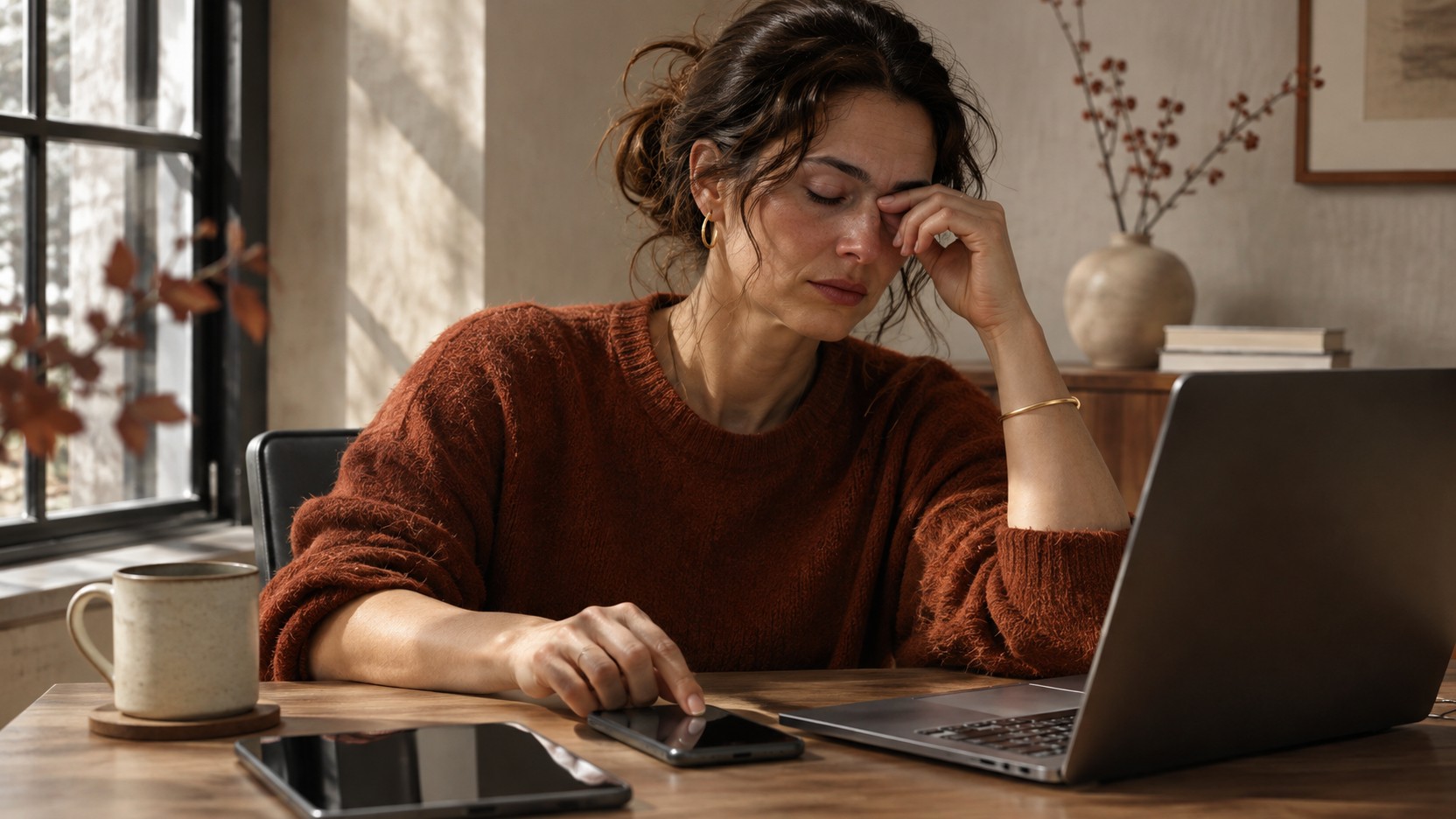 🔍 PLATE 02 — CLICK TO EXPAND
Plate 02 — Tired Professional Pausing Between Laptop and Tablet Screens in Quiet Afternoon Light: Plate 02 (The Glass Ceiling): Sensory exhaustion from hours of identical cold glass touchscreens that flatten physical feedback across work and leisure.
Paper Beats Pixels: Why Print Feels More Trustworthy
One of the most interesting manifestations of this shift is print's unexpected resurrection. In an era when digital distribution costs essentially nothing, physical printed materials have become premium brand touchpoints precisely because they require investment and intentionality.
This is what we might call the 'effort signal'—physical materials communicate care and commitment in ways that digital simply cannot replicate. When a brand sends a beautifully printed catalogue or lookbook, they are demonstrating that they value the relationship enough to invest in something tangible. The permanence of print creates a fundamentally different relationship than ephemeral digital content that disappears with a scroll.
Brand magazines are returning with renewed purpose. Direct mail is being reconsidered as a premium touchpoint rather than an outdated tactic. Independent publishing and zine culture are influencing commercial brand communication, bringing handmade aesthetics and tactile experimentation into mainstream marketing.
Perhaps most significantly, consumers appear to trust printed claims differently from digital ones. The paper quality, weight, and finish all communicate values before a single word is read. A heavy, uncoated stock with visible fibre whispers craftsmanship and honesty. A flimsy, glossy leaflet suggests disposability regardless of its content.
The Texture Taxonomy: Materials That Ground Us
Beyond print, we are witnessing a broader return to tactile materials across product design, packaging, and brand environments. Understanding this vocabulary of texture helps explain why certain brand touchpoints feel more authentic than others.
Natural Fibres and Textiles
Linen has emerged as perhaps the quintessential material of the moment. Its irregular weave and natural variation communicate earthiness and honesty that synthetic alternatives simply cannot match. Look at premium packaging, retail environments, and product design—linen appears everywhere, often in undyed, natural tones that celebrate rather than disguise its organic origins.
Canvas and unbleached cotton serve similar purposes, whilst wool and felt add warmth alongside their acoustic and tactile properties. These materials feel alive in ways that manufactured alternatives do not.
Raw and Processed Woods
The preference for raw timber reflects a desire for visible grain, knots, and natural imperfection. Unfinished surfaces that retain tactile character rather than being sealed smooth are increasingly valued. Even plywood and veneer are being celebrated for their honest construction rather than disguised with fake wood effects.
Mineral and Ceramic Materials
Textured plaster is returning through lime washes, clay renders, and deliberately imperfect wall finishes. Unglazed ceramic offers matte, porous surfaces that engage the fingertips far more than glossy alternatives. Stone finished with honed rather than polished surfaces shows use and age gracefully.
Finish Innovations
The shift from glossy to matte spans nearly every product category. Soft-touch coatings—those rubberised and velvet-touch finishes—have transformed packaging and electronics. Embossing, debossing, and dimensional printing techniques add physicality to two-dimensional surfaces.
Across cosmetics packaging, premium electronics, hospitality design, and food and beverage, brands are embracing these materials with genuine enthusiasm. The common thread is intentional tactile engagement—surfaces that ask to be touched rather than merely looked at.
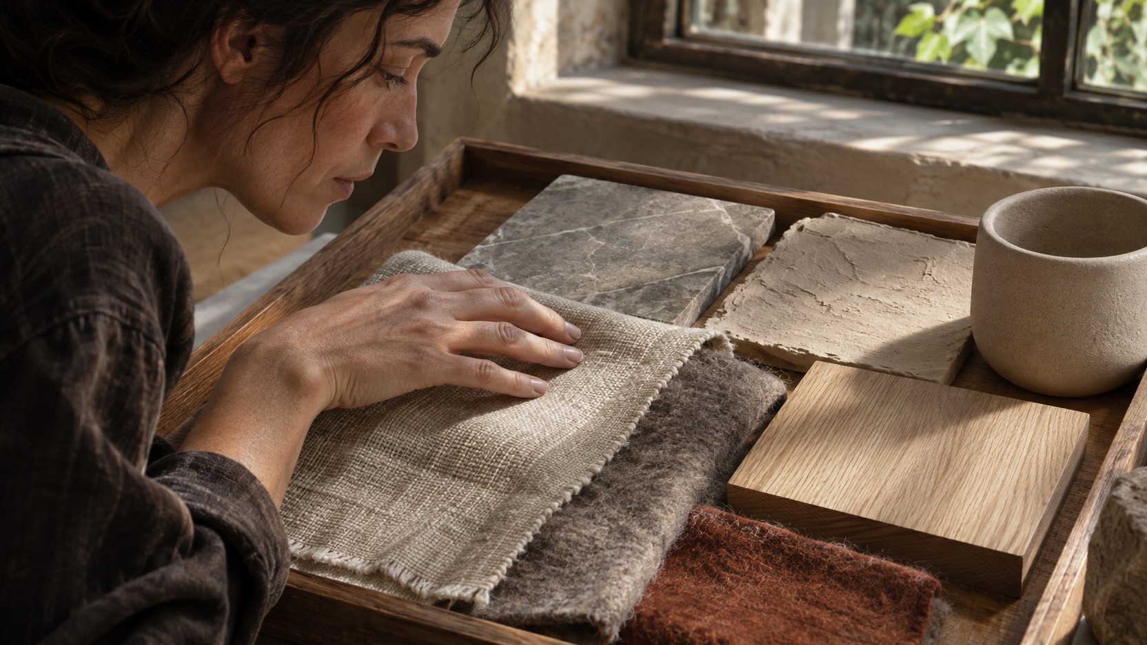 🔍 PLATE 03 — CLICK TO EXPAND
Plate 03 — Materials Designer Exploring Tray of Linen, Felted Wool, Unfinished Oak, Stone, and Clay Plaster: Plate 03 (The Texture Taxonomy): Raking daylight across natural textiles, unfinished timber, honed stone, and unglazed clay reveals the material vocabulary grounding 2026 brand experiences.
Soft Interfaces and Material Matte: Texture on Screen
Of course, not every brand touchpoint can be physical. Digital remains essential, and interestingly, screen-based design is responding to the same sensory needs through increasingly sophisticated approaches.
The Soft Interfaces movement represents a significant departure from the flat, minimalist aesthetic that dominated the previous decade. These designs incorporate organic shapes, subtle gradients, and material-inspired textures that create visual warmth. Soft shadows, gentle curves, and implied depth replace the stark, clinical precision that once defined modern digital design.
Material Matte aesthetics take this further, creating digital surfaces that explicitly reference physical materials. Paper textures, fabric backgrounds, and grain effects appear throughout contemporary digital design. Noise, subtle texture, and intentional imperfection humanise interfaces that might otherwise feel sterile.
We are also seeing a thoughtful return of skeuomorphism—not the literal imitation of early touch interfaces, but material reference that creates tactile suggestion. Subtle shadows, layering, and depth cues slow the eye and create engagement in ways that flat design often failed to achieve.
There is an inherent paradox here, of course. Screens cannot truly provide tactile experience—they remain smooth glass regardless of what they display. But digital texture serves a different purpose: it creates anticipation for physical brand encounters and provides visual rest from the overwhelming flatness of most digital environments.
The Friction Strategy: Designing Deliberate Difference
The most sophisticated brands are thinking strategically about sensory contrast. They understand that tactile moments become more impactful precisely because they are rare. The smoothness of digital actually increases the resonance of physical texture when it finally arrives.
This requires intentional touchpoint mapping—identifying where physical interaction occurs in the customer journey and maximising tactile impact at those key moments. Unboxing experiences deserve particular attention, as do retail environments and printed communications. When physical touchpoints are scarce, each one carries increased significance.
The goal is not to abandon digital convenience—that train has long departed—but to create deliberate punctuation. Physical texture becomes a reward, an earned experience after the efficiency of digital interaction. This 'both/and' approach acknowledges that digital dominance is not reversing whilst recognising that human sensory needs have not fundamentally changed.
 🔍 PLATE 04 — CLICK TO EXPAND
Plate 04 — Customer Untying Linen Ribbon and Textured Cotton Wrap During Deliberate Unboxing Ritual: Plate 04 (The Friction Strategy): Pairing frictionless digital ordering with slow, multi-sensory physical unboxing that deepens brand memory and perceived value.
Your Questions About Tactile Brand Experience
Is this just nostalgia for a pre-digital world?
Not at all. This represents sensory rebalancing rather than nostalgic retreat. Tactile design is a forward-looking response to current conditions—our bodies and minds adapting to digital saturation by seeking necessary contrast. It acknowledges technology whilst addressing genuine physiological needs.
How can digital-only brands incorporate tactile thinking?
Digital-only brands can embrace material-inspired design through the Soft Interfaces movement, incorporating textures, shadows, and dimensional elements into their interfaces. They can also invest strategically in limited physical touchpoints—packaging for shipped products, printed materials for key communications, and experiential events that create memorable tactile moments.
Does tactile design cost significantly more?
Not necessarily. Many material choices are cost-neutral—matte finishes often cost the same as glossy alternatives. The key is strategic investment: reducing quantity whilst increasing quality often balances budgets effectively. A single beautifully printed piece can replace numerous forgettable digital communications.
Which industries benefit most from tactile emphasis?
Beauty and cosmetics, food and beverage, hospitality, publishing, premium consumer goods, and wellness all see immediate benefits. However, tactile design principles apply universally—any brand with physical touchpoints can enhance them, and any digital brand can incorporate material-inspired design thinking.
Where Do We Go From Here?
Screen fatigue is not a passing trend—it is a genuine physiological and psychological phenomenon that will only intensify as our digital lives continue expanding. Tactile design represents necessary sensory balance rather than anti-digital sentiment.
The brands that will thrive are those mastering both digital efficiency and physical resonance, creating deliberate contrast that amplifies both. They understand that human beings remain fundamentally embodied creatures, even as our lives become increasingly mediated through screens.
Start noticing your own tactile responses. Pay attention when your fingers encounter something unexpected—a textured surface, an unusual material, a finish that invites touch rather than merely tolerating it. Consider what that sensation communicates and how it shapes your perception of the brand behind it.
Just as our hands crave variety and truth, so do our eyes. In our next episode, we explore why brand photography is abandoning controlled perfection for documentary immediacy—tracing photography's turn from performance to presence, where candid moments, real skin texture, and unscripted interaction replace posed studios and heavy retouching.
 🔍 PLATE 05 — CLICK TO EXPAND
Plate 05 — Shopper Touching Textured Ceramic Vessel and Folded Linen Throw in Independent Design Store: Plate 05 (Where Do We Go From Here?): Quiet, screen-free sensory attention in an independent retail space built around honest materials that reward physical touch.
⚡ 5 Strategies to Consider
STUDIO PLAYBOOK // 5 DIRECTIVES❓ Frequently Asked Questions — 5 Q&As (5 Q&As)
SCHEMA.ORG/FAQPAGE // 5 Q&As (5 Q&As)Q1. What exactly is screen fatigue and why should brands care about it?
Screen fatigue describes the cumulative sensory exhaustion from interacting primarily with smooth, flat glass surfaces throughout the day. Brands should care because consumers experiencing this fatigue actively crave physical grounding and tactile variety, creating opportunities for brands that provide meaningful sensory contrast through textured materials and thoughtful physical touchpoints.
Q2. Which tactile materials are most effective for building brand authenticity?
The most effective tactile materials include natural fibres like linen and unbleached cotton, raw timber with visible grain and imperfections, textured plaster and lime washes, unglazed ceramic, and matte finishes across product categories. These materials communicate earthiness, honesty, and intentionality because they engage the sense of touch in meaningful ways.
Q3. How can digital-only brands incorporate tactile design principles?
Digital-only brands can embrace the Soft Interfaces movement by incorporating organic shapes, subtle gradients, material-inspired textures, and dimensional shadows into their interfaces. They can also invest strategically in limited physical touchpoints such as premium packaging for shipped products, printed materials for important communications, and experiential events.
Q4. What is the Soft Interfaces design movement?
Soft Interfaces is a design philosophy that moves away from flat, minimalist aesthetics toward organic shapes, subtle gradients, and material-inspired textures in digital design. It incorporates soft shadows, gentle curves, and implied depth to create visual warmth and sensory rest from the overwhelming flatness of most digital environments.
Q5. Why has print experienced a resurgence despite digital dominance?
Print has resurged because physical materials communicate investment and intentionality in ways digital cannot replicate. The permanence of print creates different relationships than ephemeral digital content, and consumers appear to trust printed claims differently. Paper quality, weight, and finish communicate brand values before any content is read.
EXPLORE RELATED STUDIO TAGS (10):
Glad this piece sparked something — want the matching 4096×4096px .ZIP pack?
Enter your email below for an instant direct download of Studio Seamless Pattern Pack — Drop 01 (WPAY_DROP01.zip) plus new Studio Journal essays & free drops.